Example Chart Setting: Creating a Pivot Table
Using the Chart feature, you can create a pivot table that combines multiple groups of data.
As an example, this article describes the steps to display a breakdown of age groups in a "Survey - Frequency of use of convenience stores" app.
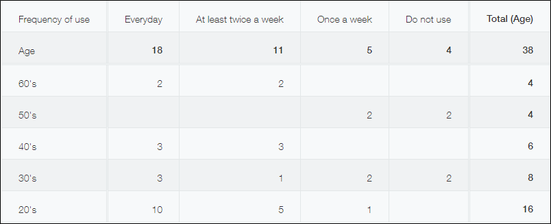
The pivot table that will be created:
Steps
To create a pivot table, follow the steps below.
-
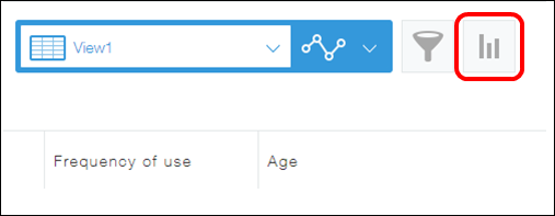
On the View screen, click the Create graph icon.
-
On the Create graph dialog, select Pivot table under Design a graph starting from graph type.
-
In the Group by section, select "Frequency of use" and "Age" for Level 1 and Level 2 respectively.
Level 1 and 2 items are displayed on the horizontal axis (row) and the vertical axis (column) respectively.
You can also add a Level 3 item in the Group by section. The Level 3 item is displayed on the vertical axis (column).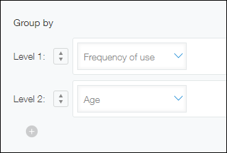
-
Select a function in the Function section to specify how you want the data to be aggregated.
In this example, select Count. -
Configure record filtering conditions as needed.
If you want to limit the scope of data aggregation to certain records, configure filter conditions. Since we do not want to filter data in this example, we will leave All records selected. -
In the Sort by section, select an option for sorting the aggregate result.
In this example, select Ascending and Descending for Level 1 and Level 2 respectively. -
Click Save as new graph at the bottom right of the screen.
-
Enter the name of the pivot table.
In this example, enter "By age" and click OK.