Creating a chart of orders received per month
In Kintone, you can set up charts on the "Create graph" screen of an app to display data by day, month, or year.
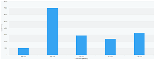
This article shows how to aggregate the monthly order data in an order management app and create a column chart like the one shown below.
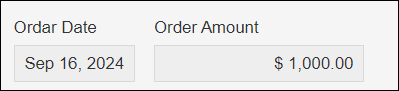
Suppose that the form has the following fields:
- Order Date field
- Order Amount field
In the steps below, we will create a column chart by aggregating the values in the "Order Amount" field and separating them by month based on the information in the "Order Date" field.
-
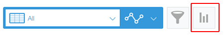
On an app's View screen, click the Create graph icon.
-
From Design a graph starting from graph type, click Column chart.
-
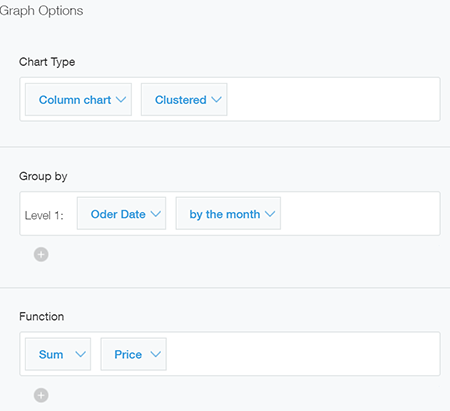
Specify each item.
- Chart type: Column chart, Clustered
- Group by (Level 1): Order Date, by the month
- Function: Sum, Order Amount
- Filter: All records
- Sort by (Level 1): Ascending
-
Click Apply.
The orders received per month will be calculated and displayed in a chart.