Chart types and their usage
This article explains the chart types supported by the Chart feature and how they can be used.
Bar chart and column chart
A type of chart where bars are used to express the total of each item.
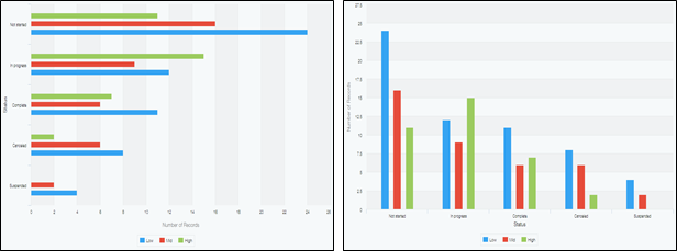
Clustered chart
A type of chart that is suitable for use when comparing the amount for different item categories.
Records are categorized by the value of the item that is specified in the Group by section and the total for each group is represented in a bar.
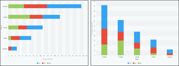
Stacked chart
A type of chart that is suitable for comparing not only the proportion of each item category to the whole but also the amount for an item category with the total.
Records are categorized by the value of the item that is specified in the Group by section and the total for each group is stacked and represented in a bar.
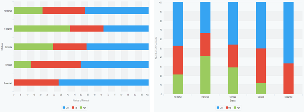
100% stacked chart
A type of chart that is suitable for comparing the proportion of each item category to the whole.
Records are categorized by the value of the item that is specified in the Group by section and the percentage of the total for each group against the whole is represented in a bar.
Line chart
A type of chart that is suitable for showing the chronological variance of the total.
Spline chart
A type of chart that is suitable for showing the chronological variance of the total. Each point in the chart is connected by a smooth curve.
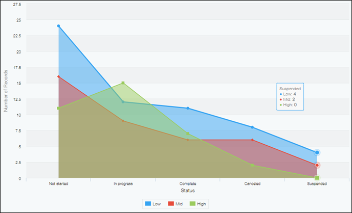
Area chart
A type of chart where the total for each item is represented in a line, with the area from each line towards the X axis is filled with a different color.
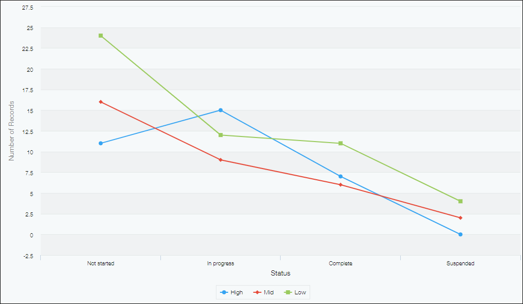
Non-stacked chart
A type of chart that is suitable for presenting the chronological variance of the total, and the difference of the total for each item.
Records are categorized by the value of the item that is specified in the Group by section and the total for each group is represented in a line.
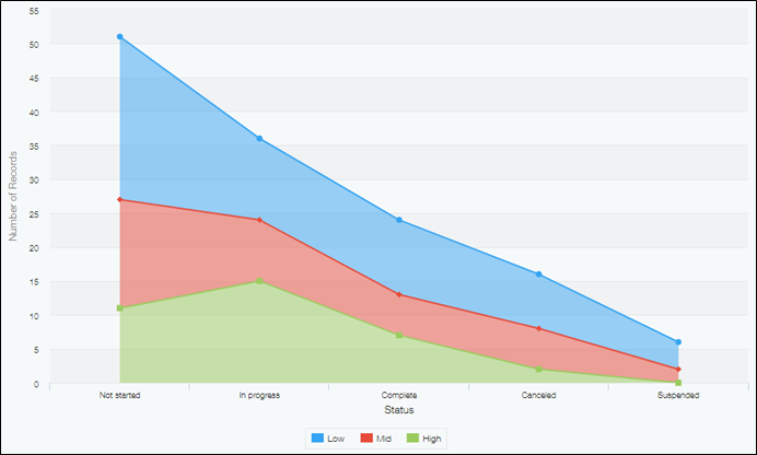
Stacked chart
A type of chart that is suitable for representing the chronological variance of the total for each item, and the variance of the overall totals.
Records are categorized by the value of the item that is specified in the Group by section and the total for each group is stacked and represented in a line.
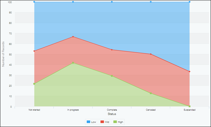
100% stacked chart
A type of chart that is suitable for representing the chronological variance of the percentage of the total value for each item against the whole.
Records are categorized by the value of the item that is specified in the Group by section and the percentage of the total for each group to the whole is represented in a line.
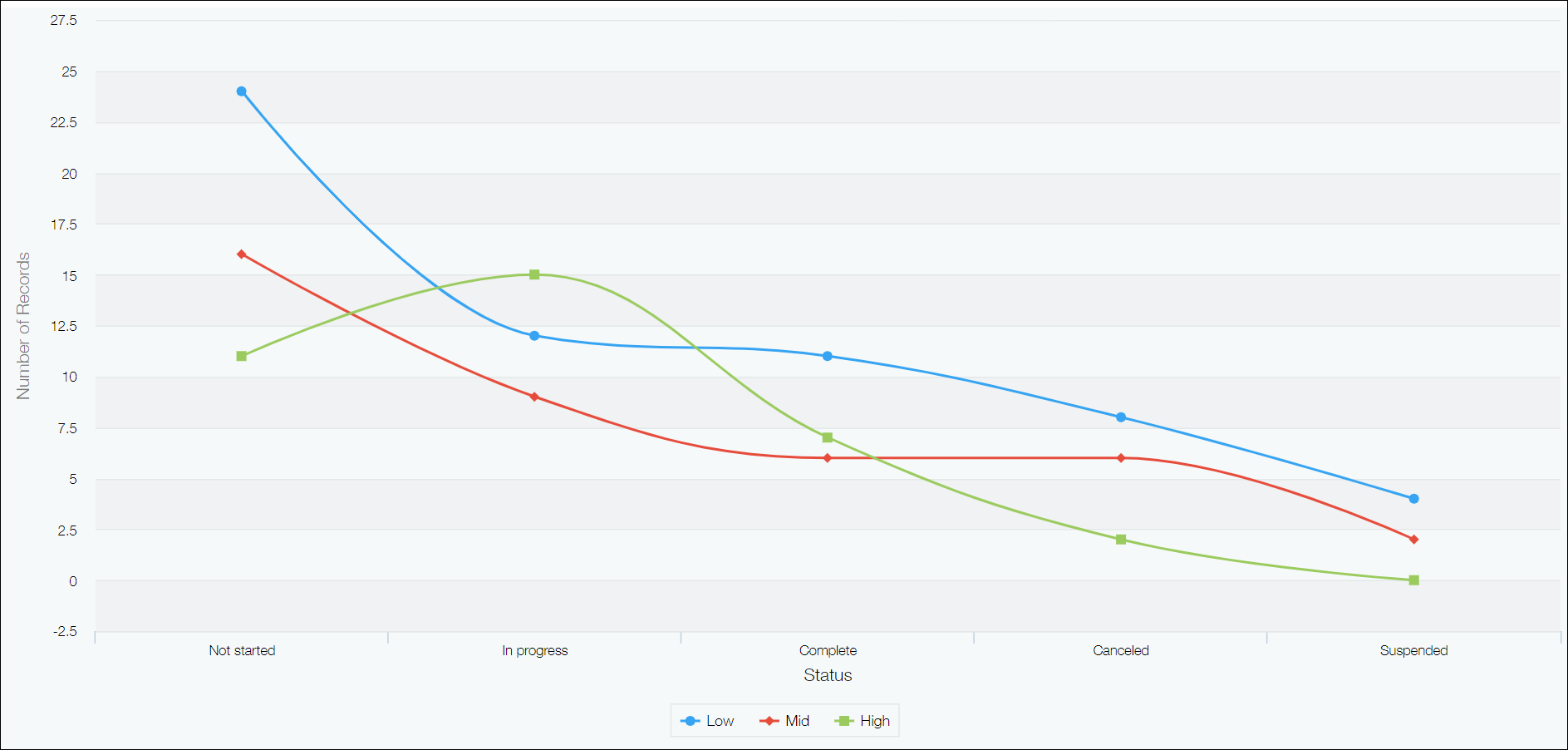
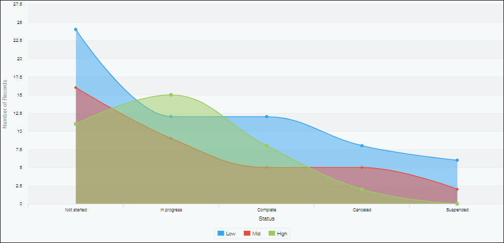
Spline area chart
A type of chart where the total for each item is represented in a smooth curve, with the area from each line towards the X axis is filled with a different color.
Non-stacked chart
A type of chart that is suitable for presenting the chronological variance of the total, and the difference of the total for each item.
Records are categorized by the value of the item that is specified in the Group by section and the total for each group is represented in a smooth curve. To express the difference of each group, the area from each curve towards the X axis is filled with a different color.
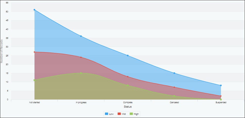
Stacked chart
A type of chart that is suitable for representing the chronological variance of the total for each item, and the variance of the overall totals.
Records are categorized by the value of the item that is specified in the Group by section and the total for each group is stacked and represented in a smooth curve.
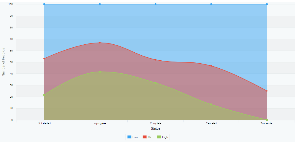
100% stacked chart
A type of chart that is suitable for representing the chronological variance of the percentage of the total value for each item against the whole.
Records are categorized by the value of the item that is specified in the Group by section and the percentage of the total for each group to the whole is represented in a smooth curve.
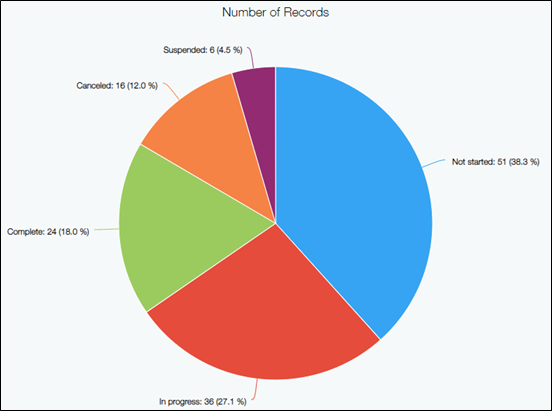
Pie chart
A type of chart that is suitable for representing the percentage of the total for each item against the whole.
Records are categorized by the value of the item that is specified in the Group by section and the percentage of the total for each group to the whole is represented in a pie.
Table
If you want to focus more on figures rather than differences or variances of an aggregate result, the list format is more suitable than the chart format.
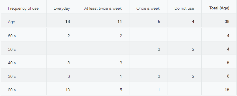
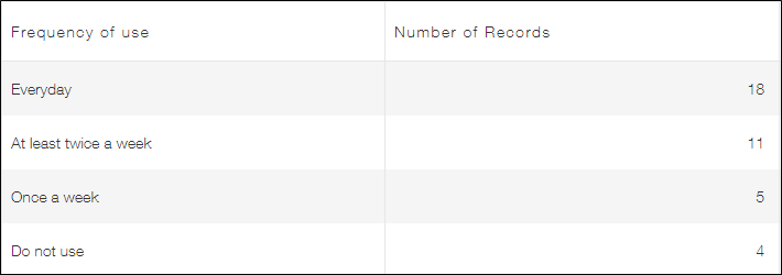
Table
In this format, an aggregate result is expressed in numbers either without being categorized or being categorizing in one field.
For example, you can use the table to count the number of records whose value for the "Frequency of use" field is "Every day," which is 18, or the number of records whose value for the field is "At least twice a week," which is 11.
Pivot table
In this format, records are categorized into multiple fields, and figures of an aggregate result is calculated and summed up row-wise and column-wise.
For example, using the frequency of convenience store use of the previous table, you can create a pivot table that represents the breakdown of the age profile. When configuring the chart setting, specify "Frequency of use" and "Age" for Level 1 and Level 2 respectively.